We build apps, websites and AI solutions for businesses across Kent, London & the UK
Award-winning digital development from Canterbury. Serving clients nationwide.
iOS & Android apps, fast scalable websites, and AI integration that adds real value. In-house UK team. No outsourcing. 75% of clients return for more.
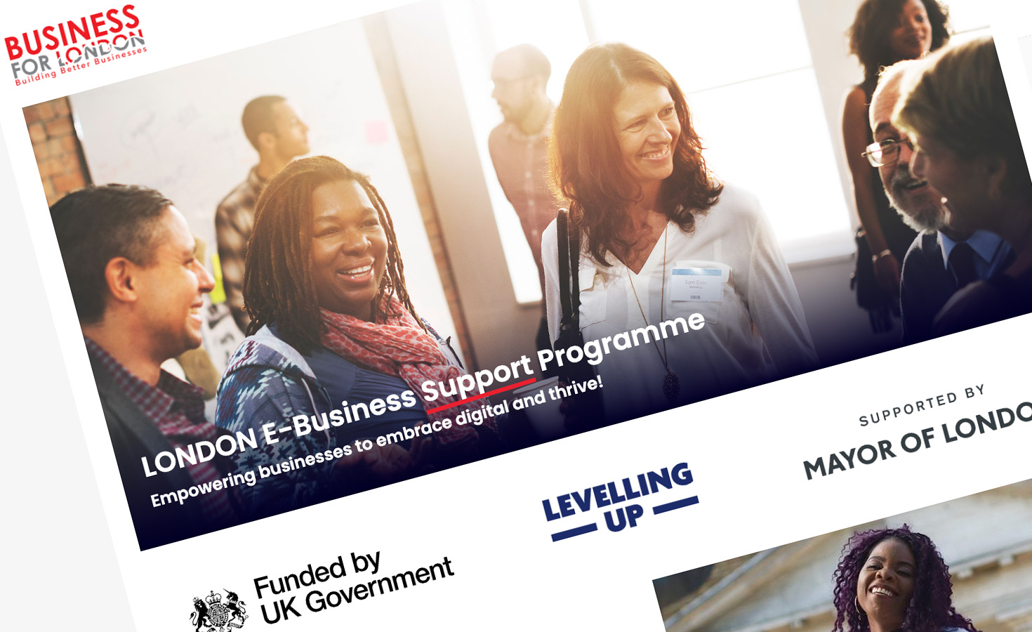
Interested? Learn about our 23 years of experience in Sports, Construction, FinTech, Public Sector and NHS MedTech solutions.
Engaging, robust & scalable.
Tinderhouse builds enterprise mobile apps and websites. We love what we do and so do our clients. So much so that most ask us to work for them time and time again.
Passionate, curious & innovative.
We do client service work, launch our own products, and collaborate with partners to create great digital experiences and online communities.
Think, do, repeat.
All the latest thinking and doing from Tinderhouse.
Tinderhouse is ranked as one of the UK's top 50 mobile app development companies.
Call +44 (0)1227 811771, book a 15-min strategy chat, or email us to discuss your project.
Our services
AI & Intelligent Automation
We help businesses harness the power of AI to stay ahead. From building autonomous AI agents to developing AI-powered features and secure AI & RAG systems that enhance user experience, we turn emerging technologies into competitive advantages.
Explore AI & Automation →Mobile App Development
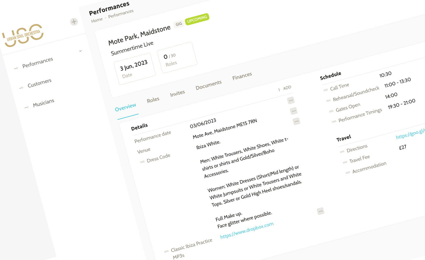
Our in-house team delivers award-winning mobile apps for iOS and Android. From startup MVPs to elite-level platforms, we build native and cross-platform solutions that scale from thousands to millions of users.
Explore App Development →Bespoke Web Systems
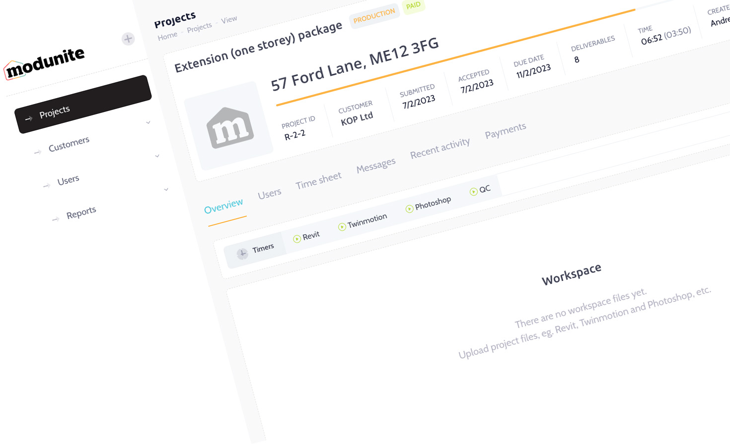
We design and develop websites, web apps, and digital platforms built for performance and growth. From progressive web apps to complex content management systems and SaaS platforms, we create scalable solutions that work across all devices.
Explore Web Development →Sectors
We provide specialist engineering for high-stakes sectors including Health & MedTech, FinTech, and Construction & Field Operations. Our technical pedigree includes serving as Official Technology Partner to Team Sky for a FTSE 100 corporation: delivering pro-grade GPS tracking for Tour de France champions alongside scalable Sports & Endurance platforms reaching millions of global users.
Explore Sectors →Strategy & Discovery
We don't just write code, we solve problems. Through technical discovery, user research, and strategic planning, we help you define the right solution before a single line of development begins. This covers architecture design, platform selection, and clear roadmaps that connect technology decisions to business goals. For teams navigating AI adoption, our dedicated AI consulting service helps identify which opportunities are genuinely worth pursuing and in what order.
Partnerships & Support
We act as a dedicated Fractional Product Team for organisations requiring elite technical ownership on retainer. Our "Elite Pod" model replaces the need for internal hiring, providing senior technical leadership, UI/UX design, and investor-ready engineering. From venture-backed startups scaling their MVP to established brands seeking a managed technical department, we deliver permanent stability and architectural foresight without the overhead of in-house management.
Frequently asked questions
Everything you need to know about working with Tinderhouse, from costs and timelines to our process and expertise.
No. All development work is completed in-house at our offices in Canterbury, Kent and London by our UK-based team. We don't outsource to third-party agencies or offshore development partners. This ensures consistent code quality, clear communication throughout your project, and the ability to work closely with you during development. When you contact us, you're speaking directly with the people building your app.
Our services cover the entire digital ecosystem.
We don't just build apps - we build intelligent digital solutions. Our expertise spans prototypes, MVPs mobile apps, websites, autonomous AI agents & AI-powered features, wearable technology, e-commerce, SaaS solutions and all the backend infrastructure needed to make your vision a success. From smart recommendation systems to automated data processing, we integrate AI where it adds real value.
Our mobile apps, websites, and AI solutions are helping businesses grow, be more efficient and sell more through smart technology that works. Talk to our experts about your project. Call +44 (0)1227 811771, book a 15-min strategy chat, or email us to discuss your project.
Already know what you want? Use our app price calculator to get a quote for your app.
Our work


As well as apps for phones and tablets, we build websites that drive results.


Why should you choose Tinderhouse?
We take pride in our partnerships with our clients. Here are more reasons to work with us.
Did you know...
BSkyB commissioned us as Official Technology Partner to Team Sky (2010-2015), building the app that connected millions to Tour de France champions.
We launched Map My Tracks in 2007. It's now used by millions of passionate athletes around the world everyday.
Noted, a service by Tinderhouse, is revolutionising field operations keeping remote teams connected.
On average, apps developed by Tinderhouse get a 4.6 star rating.
We're proud to have worked with...


- Vote Match
- Revolve24
- Cisco Systems
- BSkyB
- NHS
- Willis re
- BBA
- London School of Economics
- Brachers
- Revelation TV
- Kent Community Health
- Edison Investment Research
- Hansard Society
- IS Research
- Freshfields
- Equity Strategies
- Kent County Council
- Psych Revise
- HotChillee
- Bladonmore
- Bicycle Association of GB
- Hadlow College
- Team Sky
- Tour of Britain
- Map My Tracks
- Lombard Odier
- Investors Champion
- Independent Resources
- Progressive Research
- Medway Council
- Société Nautique de Genève
- RaceWorld TV
Our thinking


Let's make things happen.
Check out what our clients say about working with Tinderhouse.